Design with a flair . . . Nathan Sharp ’06
Winning kudos in national communication arts competitions, Nathan Sharp ’06 emphasizes joy and play in his creative work.
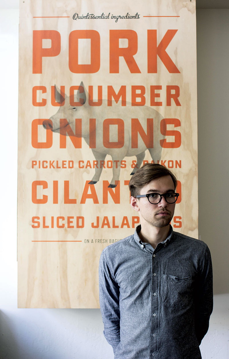
Nathan Sharp ’06 won a spot this year in the annual Communication Arts Typography Competition with their playful identity for Bun Mee, a Vietnamese restaurant.
Design with a flair . . . Nathan Sharp ’06
Winning kudos in national communication arts competitions, Nathan Sharp ’06 emphasizes joy and play in his creative work.
Under the cursor of Nathan Sharp ’06, brand identities come to life, infused with an element of joy that pleases crowds, clients and competitions. He and the San Francisco studio MINE, where he is senior designer, secured a winning spot this year in the annual Communication Arts Typography Competition with their playful identity for Bun Mee, a Vietnamese restaurant.
The Bun Mee logo uses American diner-style gas-pipe lettering and is topped with a cute red scooter. The scooter calls to mind the scooter-filled streets of Saigon, where the banh mi sandwich is sold from roadside carts. MINE designed the scooter to look casual and fun, which encourages San Franciscans to try out what may be unfamiliar cuisine. And now Bun Mee, which opened in 2011, is preparing a second location.
The American Institute of Graphics Arts, a professional organization for graphic designers, also honored the Bun Mee identity, at its annual Justified competition in 2012.
Sharp remembers how TCU graphic design professor Pat Sloan emphasized incorporating an aspect of joy and play in design — to enjoy the process of what you’re doing and not get too serious about it. The lesson didn’t soak in fully when he was a student, he says, “but in the Bun Mee identity, there’s an element of play, and with my work in general, I try to keep an element of joy in it.”
The Bun Mee project led to more restaurant work, such as for Burger Shack on the Facebook campus and Build Pizzeria in Berkeley, where diners build their own slices. For Roostertail, a rotisserie chicken restaurant in San Francisco, MINE decked out the interior in black, taking inspiration from motorcycle design, then livened up the atmosphere with playful touches. MINE borrowed some chickens, coaxed them into sitting still long enough for close-up tintype photographs, and lined the back of the restaurant with their images. One photograph, of a chicken and a wheelbarrow, alludes to the classic William Carlos Williams poem “The Red Wheelbarrow.” And while most table numbers at the restaurant are skinny, the typeface fattens for numbers in the Fibonacci sequence, a mathematical pattern known since ancient times. “Just for kicks,” Sharp says.
“Honestly, the most exciting thing to me,” Sharp says of his work, “is that people love it. You finish it, and you say, ‘We did our best, we did a good job, now go out there in the world,’ and you hope people like it — and they did. That was really exciting.”
Your comments are welcome
Comments
Related Reading:
Alumni
How TCU Alumnus Chris Reale is Leading Paris Coffee Shop Into its Next Century
Chris Reale ’17 blends creativity, grit and hard work into a successful culinary career.
Alumni
Lorie Fangio on French Cooking, Curated Travel and A Taste of Paris
The TCU alumna turned a student’s offhand question into A Taste of Paris and has led small-group culinary tours through France since 2014.