Courtesy of Kyle Walker
Open-Source Data Tools Help Put Kyle Walker on the Map
The director of TCU’s Center for Urban Studies created two free tools that allow people to tap into U.S. Census Bureau information to make their own maps.
Eleven-year-old Kyle Walker gazed out the car window at the passing towns of the Great Plains. During the summer of 1994, his family was on its annual trip from Oregon to visit relatives in Minneapolis. Walker’s father, Gregg, believed in taking the scenic route. On that year’s trip, the family of four flew to Albuquerque, New Mexico, loaded up a rental car and hit the open road for a 1,200-mile adventure.
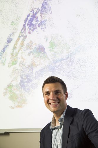
Kyle Walker used census data to develop interactive maps. The map in the background shows distribution by ethnicity in the New York area. Photo by Rodger Mallison
“We had those big AAA road maps,” Kyle Walker said. “I would just open them up in the back seat and try to find where we were.”
Those memorable family road trips — via Albuquerque and Chicago, Salt Lake City and Kansas City — helped set the course for Walker’s career. Now an associate professor of geography and director of the Center for Urban Studies at TCU, he specializes in human geography, mapping the relationships between people and their communities, cultures and economies.
Walker isn’t just creating maps for his own research projects. He has distinguished himself by empowering hundreds of thousands of people to make data-driven maps of their own.
Drawing on expertise in data analysis and visualization, Walker created two popular open-source mapping tools that tap into U.S. Census Bureau data: tigris and tidycensus. These free tools enable journalists, students, public health experts and countless others to follow their curiosities, navigate through immense amounts of census data and map their ideas.
The Scenic Route
Walker didn’t set out to democratize cartography. He focused on immigration policies as a student at the University of Oregon and then the University of Minnesota.
Throughout college, Walker had conducted geographic data analysis using closed-source commercial software, which requires a paid license and hides the proprietary source code driving the program. When the Episcopal Church in New York City hired him to conduct geographic data analysis, Walker discovered his new employer didn’t have a software license. He would have to create his own tools.
“I started to acquire a taste for data, data analytics and working with information and programming languages,” he said. “That moved me on to the trajectory that I’ve been on for the last 10 years and made me attractive to TCU.”
Upon joining TCU in 2012 to teach courses in data analysis and geographic information system mapping, among other topics, Walker once again had access to proprietary software, but he felt constrained by it. “I was teaching the software to my students, but the process was laborious and they were just struggling through it,” he said. “I thought, ‘Are there easier ways to do this?’ I started looking into and using open tools.”
Open-mapping tools and omnipresent digital-mapping apps are very different. Anyone with a laptop or smartphone can use Google Maps or its counterparts to summon a browsable, zoomable digital map to locate a popular restaurant, navigate while driving or geotag social media posts. But the source code behind these apps is secret, and users generate maps within the rules set by each program.
Open-source tools, however, invite people to read and contribute to the underlying source code. Individuals can see what other people have developed and then build new tools. “I tell my students all the time that, in research and in professional practice, it is so important to be able to show your work,” Walker said. “With open software and open science, you can say, ‘Here’s what I did.’ ”
Need an interactive US graphic for your project/article/website? `tigris::shift_geometry()` and the ggiraph package can get you up and running #rstats pic.twitter.com/aFqPNPmAMb
— Kyle Walker (@kyle_e_walker) April 30, 2021
Tools of the Trade
Walker was quick to use his growing open-tool expertise to tackle a complex subject: census data. On those family road trips, he would wonder about the small towns they passed and how one differed from the next. “Census data, more than any other dataset we have in the United States, offers a window into that,” he said. “You have tens of thousands of different data points that are available all the way down to the neighborhood level.”
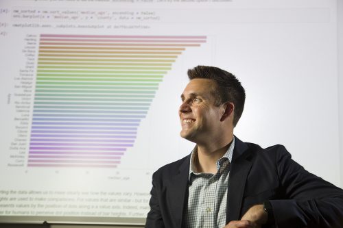
Kyle Walker uses technology to analyze open-source data and interactively map out demographic trends in American cities. The graph in the background shows demographic data from counties in New Mexico. Photo by Rodger Mallison
But muddling through the census website can challenge even an expert researcher. He said he remembers thinking, “Are there ways to automate that and take care of all the painful steps within some sort of script to get people further down the road faster to doing interesting things with the data?”
In consultation with Bob Rudis, an expert in the R programming language commonly used in open-source tools, Walker created tigris, after the scientific name for a tiger.
The tool enables users to request and download census TIGER (Topologically Integrated Geographic Encoding and Referencing) shapefiles. These files classify myriad geographic data: school and legislative districts, roads and rivers, the smallest census block to the entire nation. “Using tigris, you could say, ‘Give me all of the roads in Tarrant County, Texas,’ or ‘Give me all of the counties in Michigan,’ ” Walker said.
TIGER files do not contain any demographic information. To summon that data, he created a second tool, tidycensus. “With one command, for anywhere in the United States I can basically pull down any variable that I want: income, education, race, ethnicity,” he said. “Then I can start analyzing that data and making maps with it right away.”
Since their debut, tidycensus and tigris have been downloaded hundreds of thousands of times. Businesses and private equity funds have used the tools for market analysis. Media outlets, including The Washington Post and CNN, have drawn on the tools for stories. Researchers have analyzed racial disparities in traffic enforcement, the impact of park access on health outcomes and links between prenatal cannabis exposure and pediatric cancers, among countless topics.
“The program and tools that Kyle makes can be — and are — used by people from a wide range of academic fields, as well as people outside of academia,” said Sean Crotty, assistant professor of geography, who has collaborated with Walker on a textbook and research projects. “His work facilitates progress and advancement not just in our field of geography, but in a near-limitless range of fields.”
In 2020, Walker’s tidycensus tool was used to track and analyze Covid-related data. It has been tapped to evaluate the impacts of air pollution, subway use, in-school learning and other factors on Covid-19 risk. The University of California, San Francisco uses tidycensus in its Covid-19 County Tracker, which tabulates cases across all 3,412 counties in the U.S. More recently, the University of Texas at Austin incorporated the tool into its Texas Covid vaccine tracker.
“One of the most rewarding aspects of developing open-source software is seeing users deploy those tools to generate insights that can benefit their communities,” Walker said.
With the technological leaps in data analysis and the ubiquity of digital mapping, Walker is excited to see where his field advances next, and no AAA map exists to show him where the route continues.
“Geographic information is now everywhere,” he said. “We have all sorts of new and accessible data sources that aren’t generated just by a small number of providers, but by everyone. This creates all sorts of interesting new ways that we can think about how people interact and move around.”
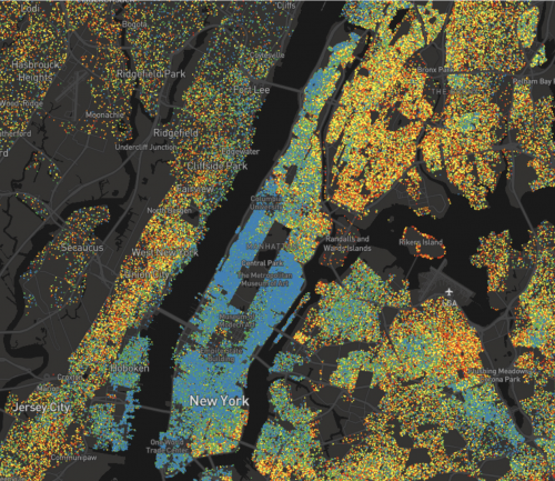
Kyle Walker created a map to show education levels of everyone over 25, starting with red to represent less than high school and moving along the spectrum to blue to represent graduate degrees. Courtesy of Kyle Walker
When Maps Go Viral
Just like cat memes and TikTok videos, maps can go viral. What drives their moment in the social media spotlight? In 2020, Kyle Walker, an associate professor of geography, tackled that question with longtime friend Jerry Shannon, an associate professor in community geography at the University of Georgia, in the paper “Ventures in Viral Cartography: Waffle House, Educational Attainment and the Social Life of Maps” for the journal The Professional Geographer.
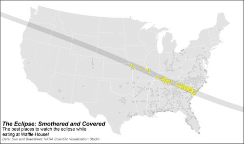 Both men created maps that went viral. Walker’s interactive dot-density map explored educational attainment by census tract in the United States. Shannon’s map, titled “The Eclipse: Smothered and Covered,” showed which Waffle House locations fell within the path of totality for the August 2017 solar eclipse.
“It’s always a surprise when your work really hits a chord with a broader public, so it was fun to try to figure out why and how that happens,” Shannon said.
He and Walker found that viral maps, in particular those covering a large area, appeal to viewers because they can place themselves within it and thus interact in a highly personal way.
“The same reason I’ve been drawn to maps my whole life is the same reason that maps like mine and Jerry’s resonate with people,” Walker said. “They’re eminently relatable. They allow us to see information about places that might not be on the surface and learn about those places in unique ways.”
– Kristin Baird Rattini
Your comments are welcome
Comments
Related reading:
Where Academic Teams Shine Together
We’re home to extraordinary academics working to make the greater good even greater.
The Geography of Heart Disease
Two TCU faculty are showing how cardiovascular disease spreads across Texas.
Research + Discovery
Climate Change? Have Another Cup of Coffee
Omar Harvey studies novel ways to capture and store carbon dioxide.